CMMS news: new analytical dashboard
If any industrial company must equip its teams with CMMS software (computer-aided maintenance management) to optimize its industrial maintenance, the choice of the solution is decisive. Indeed, conventional software does not meet the needs of the field: expensive, complicated to set up and too time-consuming, it slows down teams more than it really helps them organize their working days.
CMMS and predictive maintenance
New generation solutions, such as Mobility Work, a platform for managing mobile and community industrial maintenance, are breaking with these archaic systems. Mobility Work CMMS is a SaaS tool available in the Cloud, and functions as a real social network for industrial maintenance since it connects technicians and managers with other users, from their company, their network or even from the entire user community.
Thanks to Mobility Work, you can adapt your industrial maintenance strategy according to your needs. The solution is in fact equipped with an analytics tool, thanks to which you can find all your maintenance data compiled in graphs and tables in order to be able to analyze them. Thanks to the tool, you can see the most active users in your network, visualize the equipment that required the most hours of intervention, check which labels were used the most... Your data is thus classified to allow you to set up a predictive, or predictive, maintenance strategy, according to the results observed.
How to use the Mobility Work CMMS dashboard?
The “Dashboard” section, located in the menu on the left side of your screen, is divided into three tabs: intervention time, number of tasks and number of activities. These will allow you to display the data you are looking for based on these three variables.
Once in the tab of your choice, the filter panel (“Show more filters”) allows you to refine your search according to various criteria. The latter are similar to those for the search since they allow you, for example, to select assigned users, labels, to indicate the desired period, to display the tasks according to their status...
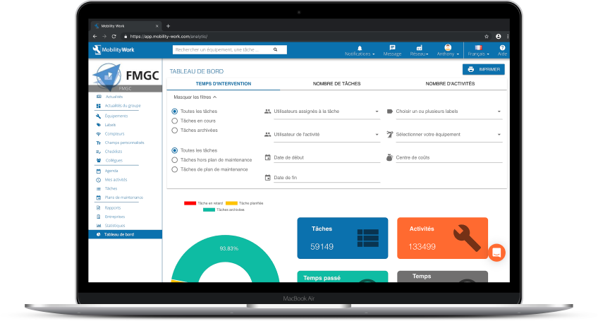
Thanks to the analytical tool's filter panel, find the data you are interested in to set up predictive maintenance
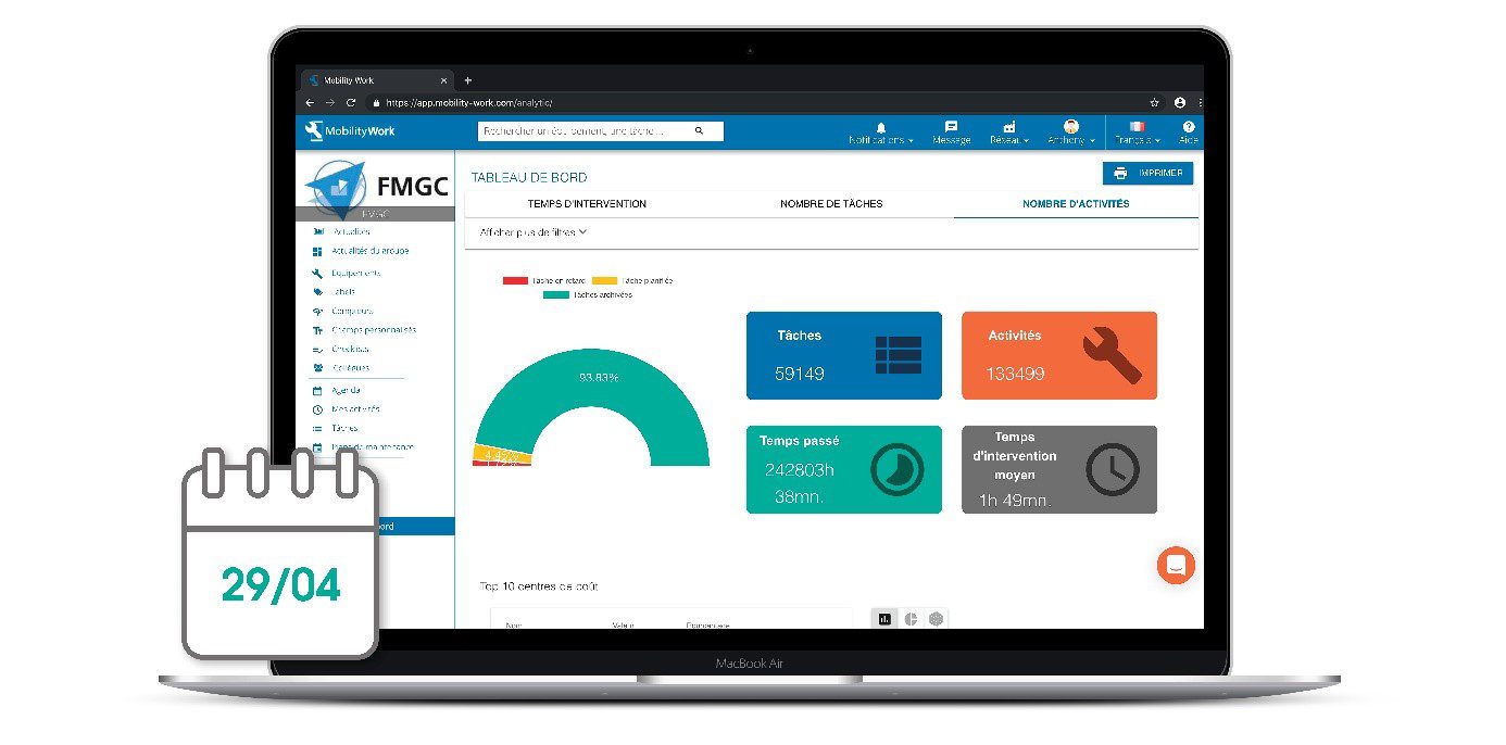
Summary chart
This graph (see screenshot above) allows you to display a percentage of overdue, scheduled, or archived tasks. These are symbolized by a color code for greater readability. By hovering your mouse over this graph, you get the exact number of tasks for each status.
Based on the criteria selected in the filters, you also visualize the total number of tasks, activities, the sum of time spent on these operations as well as the average intervention time.
Top 10 cost centers
Thanks to this box, you can see on which cost centers the industrial maintenance teams or the selected user (s) spent the most time. This data is shown on the right and allows you to opt for several representations (diagram, sticks...).
Top 10 equipment
Using this box, you can visualize the percentage of hours spent on the equipment, data visible in the various graphs or in the table, which gives you a detailed overview of the equipment that required the most hours of intervention.
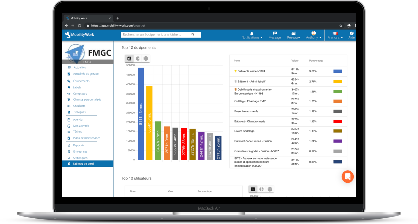
Visualize, in your CMMS, the equipment that required the most hours of intervention from maintenance teams
Top 10 users
This box allows you to display the ten most active users in your factory. They are the ones who have filled in the most hours in the CMMS. You also have access to the number of hours of industrial maintenance that each listed operator has carried out. Again, you have various visualization options: table, graph or graph.
Top 10 labels
The most used labels appear in this box, giving you the opportunity to see what types of operations are the most common in your factory (curative, preventive, mechanical...). This feature can be particularly useful for the maintenance manager, who for example has the possibility, in one click, to present factory data to his teams in the morning.
How do I create labels in my CMMS?
Top 10 most used keywords
Still in the Dashboard menu, this time go to the Number of tasks or Number of activities tabs to access the graph of the keywords that were used the most in your network. You can hover over the various sticks to see how many times these words were used on tasks or activities.
Evolution of time spent
See here, at a glance, the evolution curve of the time spent by CMMS users on industrial maintenance tasks. You can choose the period over which the data should be displayed (daily, weekly, monthly, or annual view) for a detailed and comprehensive report.
New task status menu
This time, click on the Task Status menu, at the top left of the screen, to view archived, started, scheduled or overdue tasks according to the three tabs: users, labels, cost centers. Again, you have a filter panel to refine your search. For example, you can click on the task legend to show only archived or started tasks (it is considered that a task has started when at least one activity has already been completed).

This menu can be very useful for managing all resources internally according to tasks and their progress.

Mobility Work CMMS offers several tools for monitoring the tasks and activities of members of your network.
Do you want to set up a predictive maintenance routine and streamline your maintenance processes thanks to Mobility Work CMMS? Sign up on our app to try Mobility Work CMMS for free and benefit from the analyses of this new tool now!
Any questions?
Contact us to discover the first CMMS that can be deployed in 3 weeks.